
Brand identity is the full system of visual, verbal, and tonal elements a business uses to present itself consistently. It includes your logo, color palette, typography, imagery, and tone of voice, all working together so customers recognize you instantly wherever they find you. A logo is one mark inside that system. Brand identity is the entire framework that tells people who you are, what you stand for, and why you are different from the competitor down the street.
If your marketing looks scattered or less polished than you want, the gap is usually here. Building a solid brand identity does not require a massive budget. It requires clarity, consistency, and a plan.
What Is Brand Identity?
Brand identity defined in plain English
Brand identity is everything a business deliberately designs to shape how it looks and sounds. Every color, every font choice, every word in your tagline is a decision that either pulls your business into focus or blurs it.
Why brand identity is not the same as your brand reputation
Your brand identity is what you put out into the world. Your brand reputation is what other people think and say about you after the fact. You control identity. Reputation is earned over time through consistent delivery on your promises.
The difference between brand identity and branding as a process
Branding is the ongoing work of building and managing how your business is perceived. Brand identity is the finished toolkit: the logo files, the color codes, the style guide. Branding is the verb; brand identity is the noun.
What Is Included in a Brand Identity?
Visual elements: logo, color palette, typography, and imagery
- Logo: Your primary mark and approved variations (horizontal, stacked, icon-only).
- Color palette: Typically two to four colors with exact HEX, RGB, and CMYK codes.
- Typography: Your headline font, your body font, and the rules for each.
- Imagery style: Whether photos are bright and airy or bold and high-contrast, and what to avoid.
Verbal elements: brand name, tagline, and tone of voice
Verbal identity is the part most small businesses skip. Your tone of voice governs every caption, email, and product description. Documenting that choice keeps your copy consistent whether you write it yourself or hand it to someone else.
Experiential elements: packaging, signage, uniforms, and promotional products
Every touchpoint a customer physically encounters either reinforces your identity or contradicts it. Promotional products for brand consistency are one of the most underused tools in a small business marketing toolkit because people keep and use them, keeping your brand visible long after a social post disappears.
How these elements work as a system, not a checklist
When your Instagram grid, invoice template, storefront signage, and team shirts share the same colors and fonts, customers trust you faster. Consistency signals attention to detail, and that transfers to how people feel about your product or service.
Brand Identity vs Logo: What Is the Real Difference?
A logo is one mark; brand identity is the entire system around it
A logo identifies you. Brand identity communicates everything about you. Your logo is one file. Your brand identity is a full set of files, rules, and guidelines governing how everything looks and sounds across every channel.
Why buying a logo and calling it done leaves money on the table
A logo from a marketplace gives you an image, not color codes, font files, usage rules, or supporting assets. Every time a printer, web developer, or sign shop guesses at your colors or fonts, your brand drifts further from what you intended.
A quick analogy: logo as a face, brand identity as the full personality
Your logo is a face. Your brand identity is your full personality: how you speak, how you carry yourself, what you stand for. A face without personality is forgettable. Personality without a recognizable face is invisible. You need both.
How Do You Build a Brand Identity for a Small Business?
Building a brand identity is a five-step process you can work through in order:
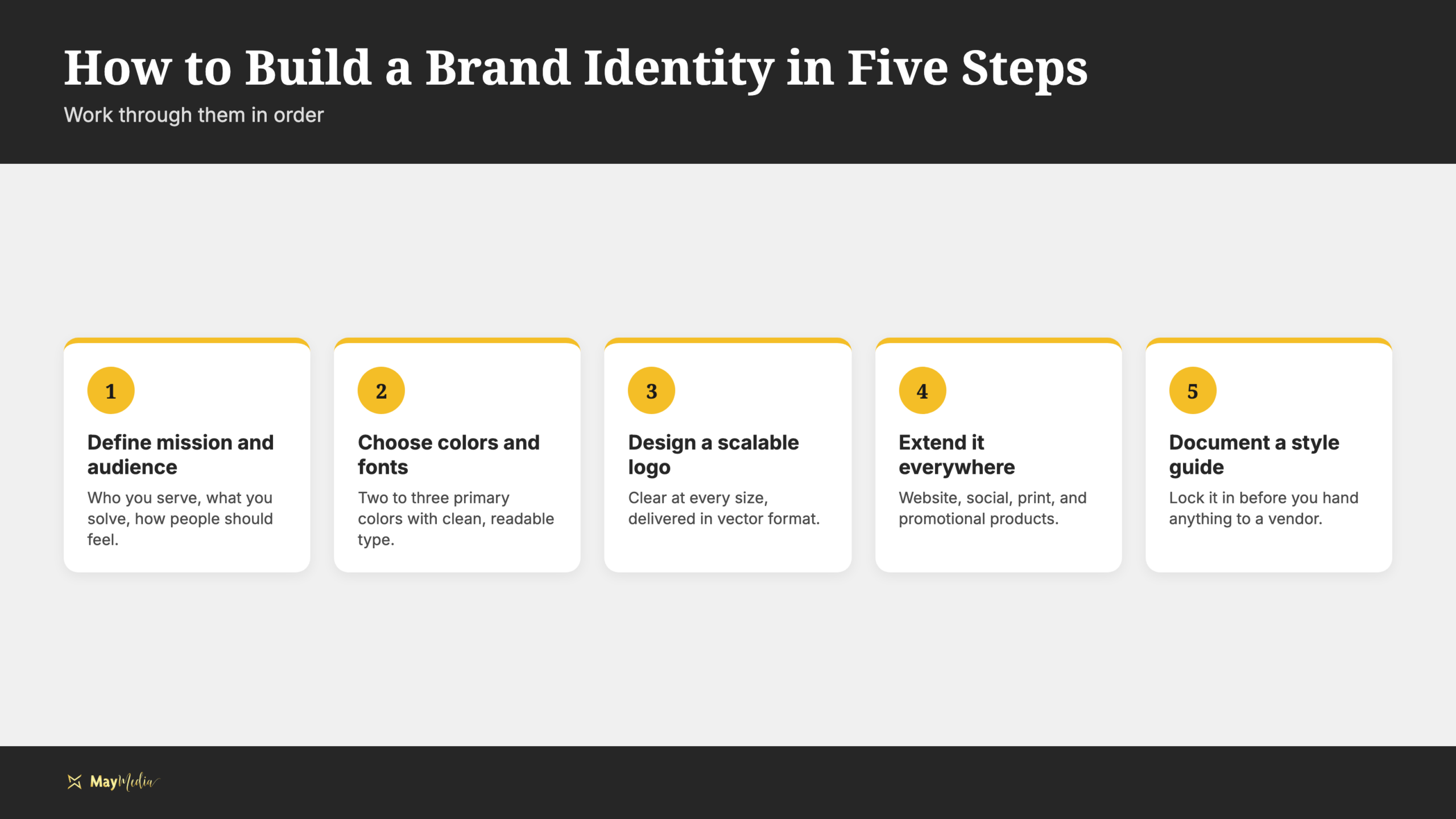
- Define your mission, values, and target audience. Who are you serving, what problem do you solve, and what do you want people to feel? Everything else flows from here.
- Choose a color palette and typography that fit your positioning. Blues read as trustworthy, greens as fresh or sustainable, warm reds and oranges as energetic. Pick two to three primary colors and pair them with clean, readable fonts.
- Design or commission a logo that works at every size. A good logo reads clearly on a business card and on a billboard. Get it in vector format (SVG or AI/EPS) so it scales without losing quality.
- Extend your identity to your website, social profiles, print materials, and promotional products. Use the same colors, fonts, and image style everywhere. Your website management services and print materials should feel like they came from the same creative director.
- Document everything in a brand style guide. This locks your work in place so it does not unravel when you hand anything off to a vendor or new employee.
What Is a Brand Style Guide and Do You Need One?
A brand style guide defined: a single document that governs how your brand looks and sounds
A brand style guide is the rulebook you send to a printer, web developer, social media manager, or photographer so they can represent your brand correctly without back-and-forth calls.
What goes inside: logo usage rules, color codes, font pairings, image style, and tone-of-voice notes
- Logo usage: Which version to use where, minimum sizes, and what not to do.
- Color palette: HEX codes for digital, RGB for screen, CMYK for print.
- Typography: Primary and secondary fonts, sizing hierarchy, and line spacing.
- Imagery style: Photo direction and what to avoid.
- Tone of voice: Brand personality description plus word choices to use and avoid.
Why even a one-page style guide beats no guide at all
You do not need a 60-page brand book. A single page covering your logo, two primary colors with codes, two fonts, and a short tone description keeps most vendors on track. The U.S. Small Business Administration’s free marketing plan guidance walks you through building a plan, and a documented identity is what makes that plan repeatable once you hand the work to a vendor or a new hire.
How to store and share your guide so every vendor and contractor uses it
Keep your guide and brand files in a shared folder (Google Drive or Dropbox) and link to it in every vendor onboarding email. Content management support can help you keep those assets organized and applied consistently as you grow.
When Should a Small Business Rebrand?
Five clear signals it is time
- Mismatched mission: Your current look no longer reflects what you do or who you serve.
- Dated visuals: Your brand looks like it was designed ten years ago, because it was.
- Invisible differentiation: You look like every competitor and cannot explain why a customer should choose you.
- Business model shift: You pivoted services, moved to a new market, or changed your target audience.
- Reputation reset: A significant business change warrants a visible fresh start.
When NOT to rebrand
Boredom is not a strategy. Rebranding has a real cost in time, money, and customer confusion. Do not do it without a clear strategic reason.
What actually drives the cost of a logo or identity project
Pricing depends on how many logo marks and variations are included, whether a brand style guide is part of the deliverable, how many revision rounds are covered, and whether the work comes from a freelancer, a marketplace, or an agency. Before you commit, ask for a file list.
How to decide whether you need a full rebrand or just a refresh
A refresh updates specific elements, such as modernizing a font or refining a color palette, without rebuilding from scratch. If your core equity is strong but execution looks dated, start with a refresh. If the problem is deeper, strategy comes first, then the visual work. Professional photography for your brand is often the fastest way to modernize a brand’s look without touching the logo at all.
Get Help Building Your Brand Identity
You now have a clear map: what brand identity includes, how to build it step by step, and when a rebrand makes sense. If you want to work through it yourself, the framework above is enough to get started this week. If you would rather hand it off to a team that does this every day, May Media’s graphic design team can apply your identity consistently across your website, your content, your print materials, and your promotional products. Visit maymedia.com or head to the contact page to start a conversation.